March 2020. Most of the world has gone non-contact and digital. However, for many people banking still remains a duty preferably fulfilled offline. This innovative ATM could be an effective way to reduce the number of customers inside the bank branches and keep both the customers and the retailers safe and healthy. It is able to serve with as little contact as possible – using face recognition, voice control and AI chatbot.
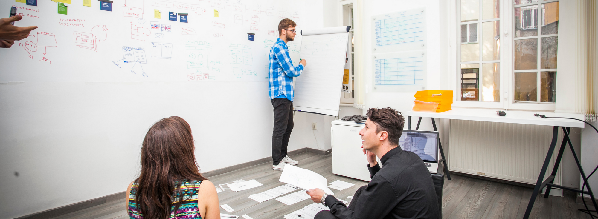
We came up with this idea during the first LB* hackathon in September 2017. Our goal was to find a suitable UX problem, to define it correctly and to come up with a solution in the scope of a minimum viable product (MVP). This means building the most basic prototype, however imperfect, that would allow us to test our idea. However, as we saw later, creating an MVP in a single day requires a really hellish pace.
Challenge
What was our challenge, then? We decided to focus on the banking sector, where there is still much room for improvement. We called a few qualified people from real banks to tell us about their customers and their problems. This is how we formulated the design challenge:
How to redesign ATMs so that customers prefer to use them rather than visit branches?
Starting point
From the very beginning we worked with these assumptions:
- for banks, serving customers via digital banking is more efficient than via branches,
- it is much more convenient for customers, too.
To understand why people still go to branch offices, we've invited a few banking professionals for an interview. Together we identified these 4 hypothesis why customers don’t use self-service:
- They are afraid they will go wrong and lose money via online banking.
- Their trust in employees at a branch is stronger than trust in technology.
- They don't use computers or smart devices or don't have internet access.
- They need to deposit cash or pay their physical bills.
Solution
When designing the solution, we were divided into 3 teams, each looking at the issue from a different angle (functionality, usability and emotions).
Together we created and discussed dozens of different ideas for the technology, functionality and interface until we came up with the concept of the next-generation ATM. Ladies and gentlemen, meet LB* ATM Beta!
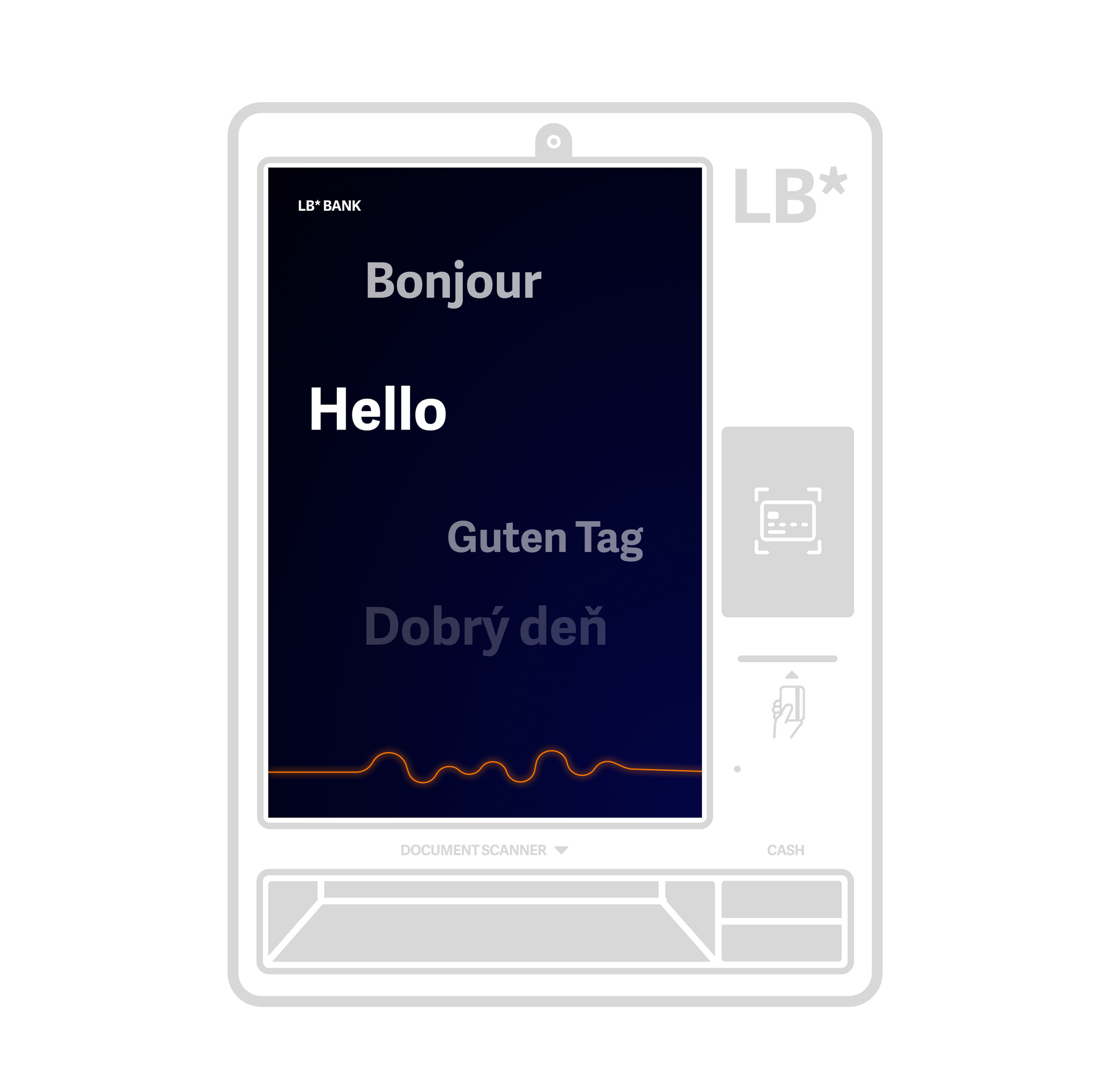
LB* ATM Beta
Privacy
In order for customers to be willing to deal with their personal finances in public space, they must have a sense of privacy. The classic design of ATMs facing the street is not ideal. We were inspired by the Spanish banking group BBVA, which turned their ATMs by 90° and enclosed them with a side wall to ensure the feeling of privacy. The customer's bad feeling of being watched should be radically reduced with this design.
Logging in
LB* ATM uncompromisingly simplifies the customer experience, including the way of logging in. Except of the credit card, all you need is your face. Identifying with a face scan is no longer science fiction, and legislative shouldn't be a problem to enforce. As a result, you only need to enclose the card to the reader and the ATM will verify you before you can put the card back in your wallet.
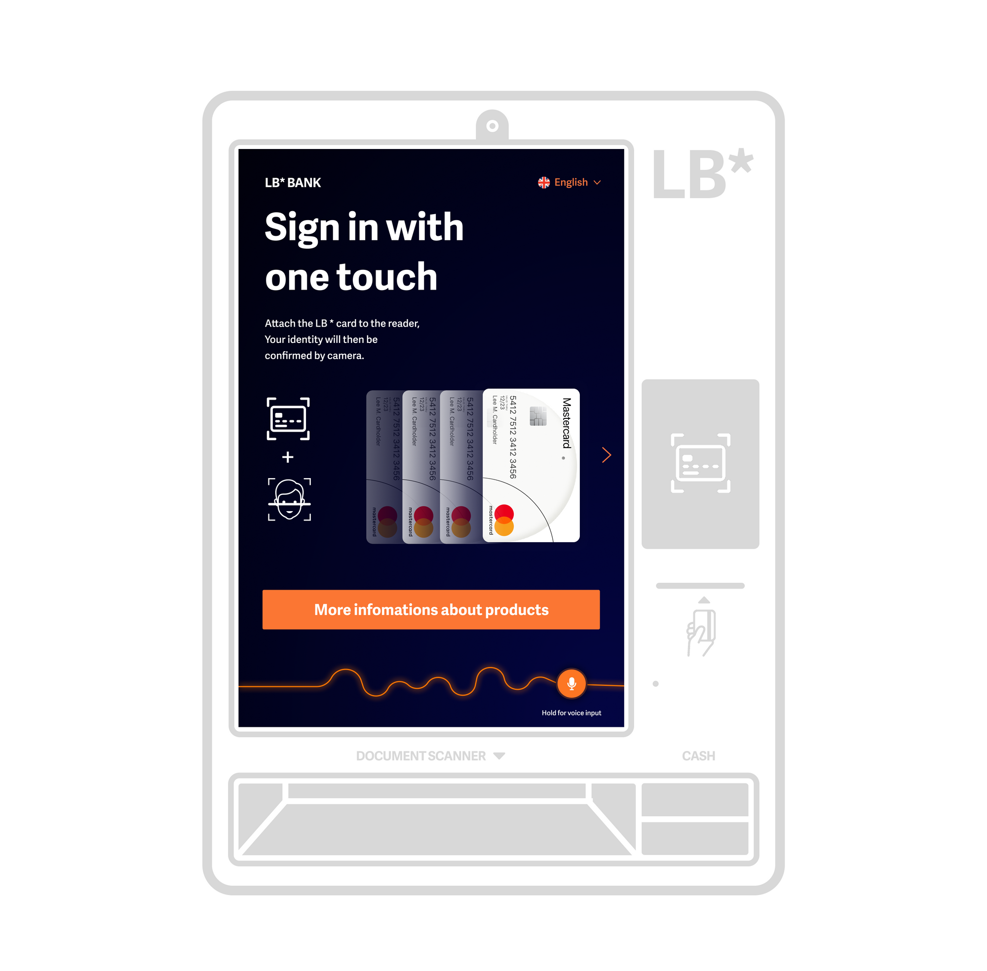
Simple payments
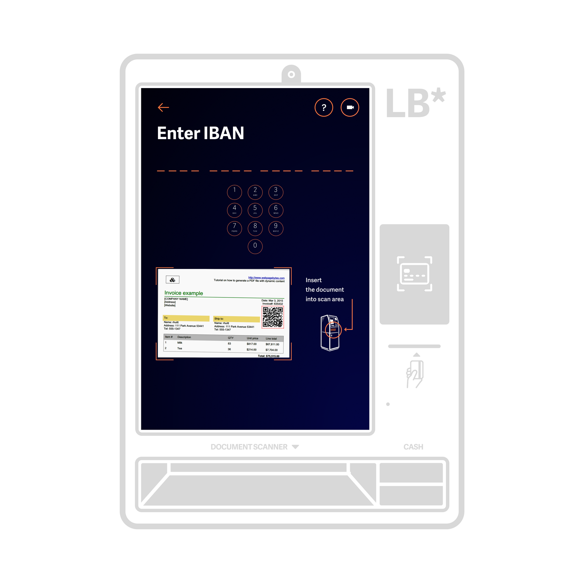
Paying your bills couldn't be any easier. Simply insert an invoice or bill into the scanner below the screen and the ATM will automatically scan all payment information. The customer will review it on screen and confirm the payment. The whole operation takes up to one minute and there is always a telephone support available directly from the ATM cubicle. The payment can be withdrawn from the customer's account or deposited in cash.
Upsell
The quality of the user experience and the upsell of new products may seem incompatible at first glance. After all, according to a national survey on 3300 participants, up to 14% of bank customers have identified the retailers pushing too hard as the biggest obstacle when visiting branches.
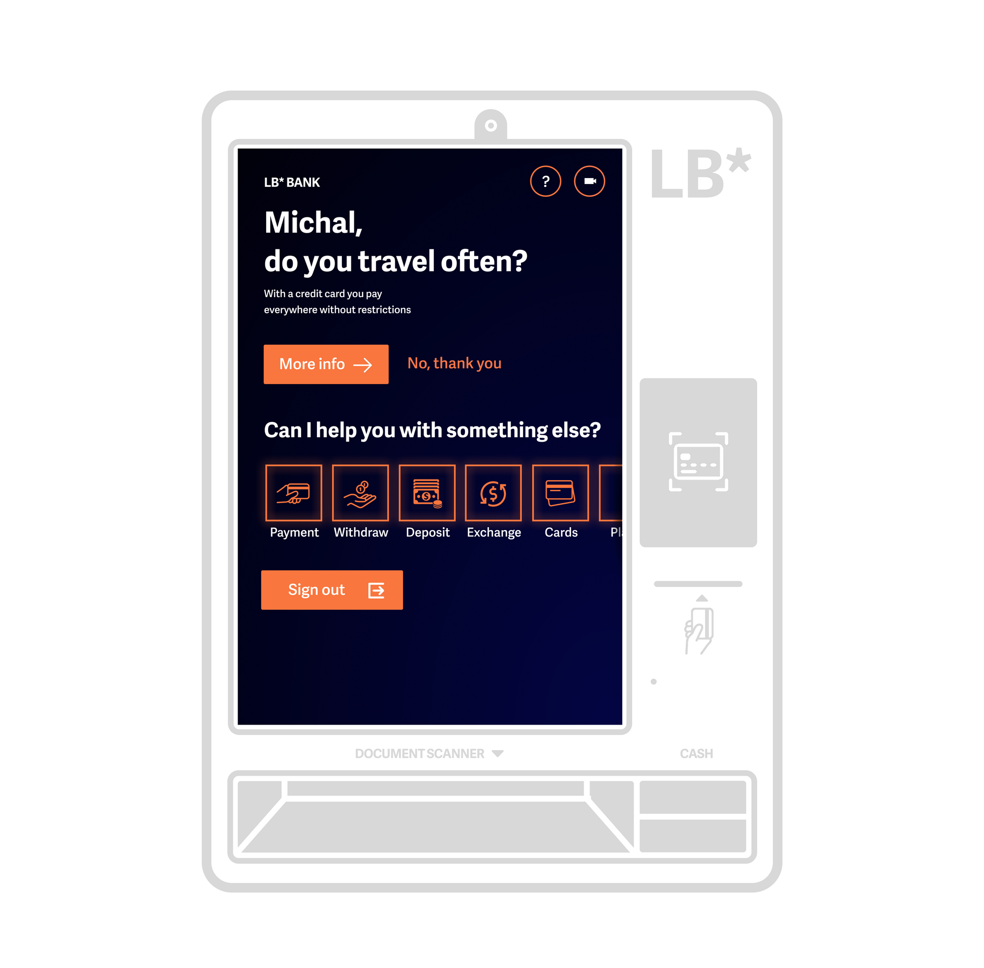
With the LB* ATM, we wanted to design an upsell that is not annoying and even improves customer experience. For example, when interacting with the ATM, personalized tips and offers appear on the screen and allow immediate handling of the request. For example, if according to credit card records the customer travels often, the ATM will offer them a discounted travel insurance.
Humanity
We can all agree that ATMs are not very friendly. The metal machines without a soul simply do not enchant anyone with a smile on their faces. To make LB* ATM at least a little human, we made it more personal and personalized.
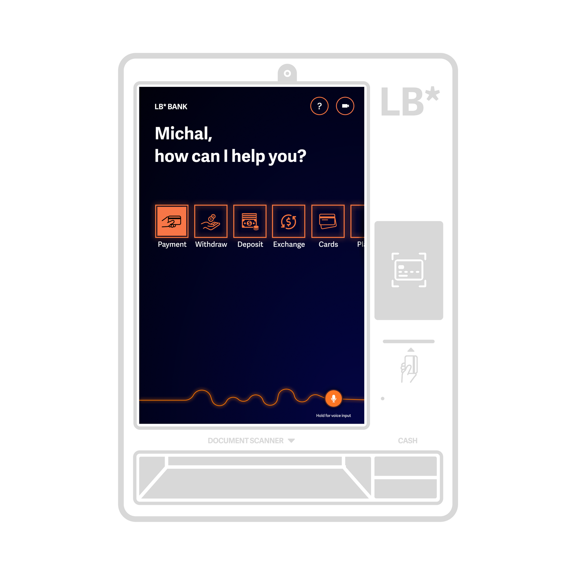
Not only it gives the user some basic information, but it also actively converse with them. It calls the user their first name, wishes a nice day and recommends not to forget the umbrella on a rainy day, for instance. Various visual elements, icons, animations and micro-interactions complete the experience.
Support
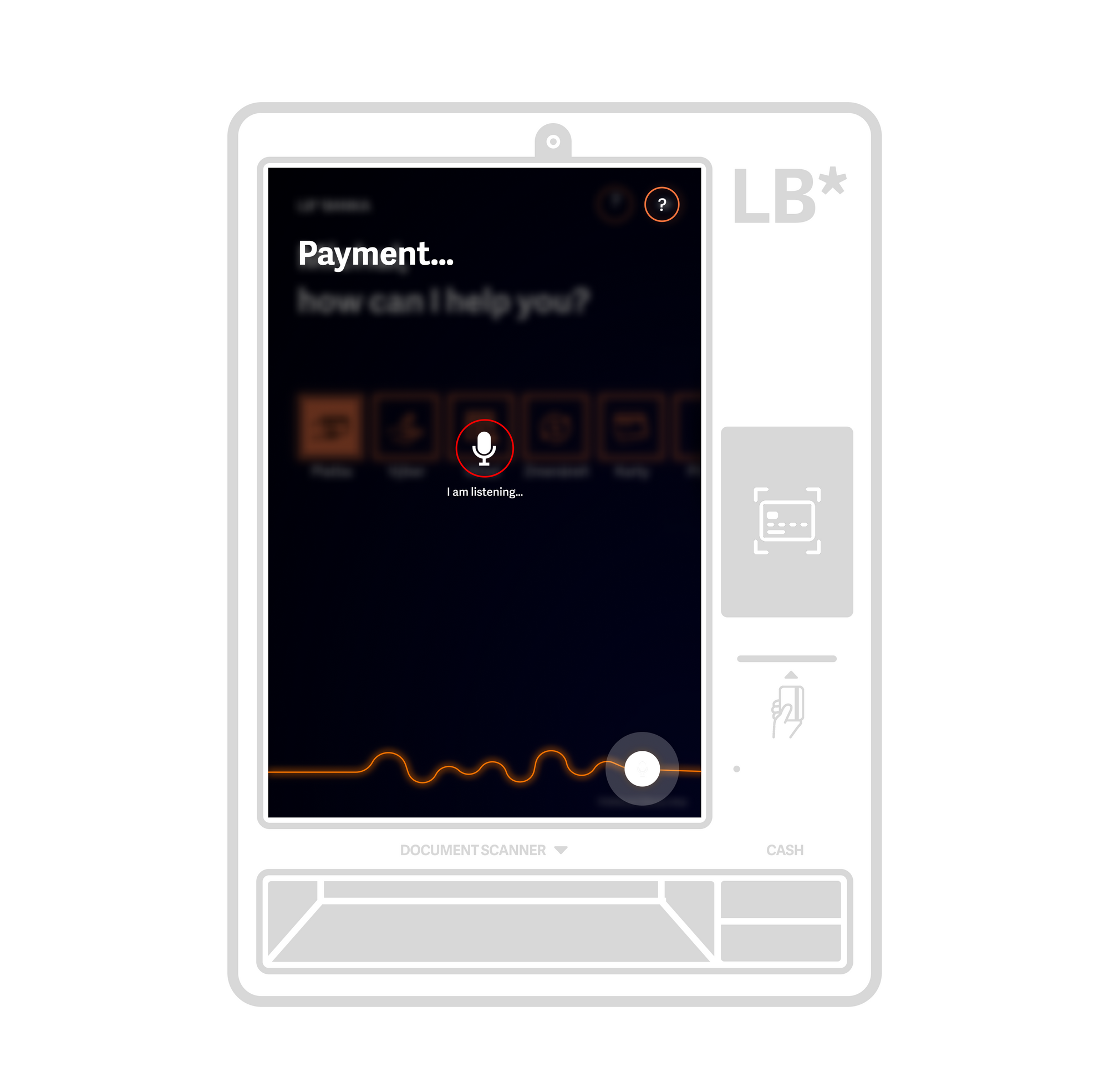
A high-quality UX should ensure that the user does not get stuck anywhere. However, they should still be able to ask for help if needed. For simple problems, a FAQ-style chatbot will be available, but the customer can also contact a call center directly at any time. An alternative to this call can be an FAQ-style audio chat where the bot answers the most frequently asked questions.
What’s next?
Digital self-service is not the solution for everything, but we can certainly agree that it can make life easier for both the users and the businesses. The combination of internet banking and smart ATMs has the potential to largely outdo branches, so they can be reduced and more specialized in complex operations such as mortgages, investing, etc.
However, do not take any of these conclusions too seriously, they are only our solutions based on many hypotheses. But be sure to tell us what you think of them.
