The Slovak e-commerce market has been stable in recent years, without seeing much growth. As of 2019, 60% of people residing in Slovakia make at least one digital purchase a year, only 1% increase since 2017. While Slovak companies turnover on e-commerce has stagnated at 21% since 2017. Of course, 2020 represents a completely different year to its predecessors, with an estimated sharp increase in online shopping due to the COVID-19 pandemic. However, official statistics won't be available until 2021. It's hard to understand why the market has not grown much in recent years, but the surge in online sales represents a big opportunity. Making sure that you have the best possible e-shop experience can give you a big lead, as the Holiday season approaches.
Good news is that just like the economical data is stable, so are best practices for e-commerce experience. Plenty of e-shops have paved the way, one A/B test at a time, to provide us with a rich understanding of what works and what doesn't. Nevertheless, it's only wise to understand that simply applying best practices is not enough—oftentimes they will only work in certain environments—but if this is your first time looking to improve the UX of your e-commerce, this is a great place to start.
We have compiled a list of best practices based on our work for Martinus, Orange and Nay—three of the biggest Slovak players in e-commerce—and other big international e-commerces are glad to share it with you.
Everything is about a well functioning funnel
Each user is unique in how they try to accomplish their goals at an e-shop. They may be looking for different products, for different reasons. Their previous experience on other e-shops will also dictate their expectations on your website. Despite all this, it's still possible to generalise the user flow into a funnel that represents how most users go from need awareness to conversion. A few funnel options are available out there, for inspiration.
For those who wish to have a grasp of how users not only interact with the e-shop, but also brand awareness, the funnel could consist of 4 phases: awareness, interest, desire and action.
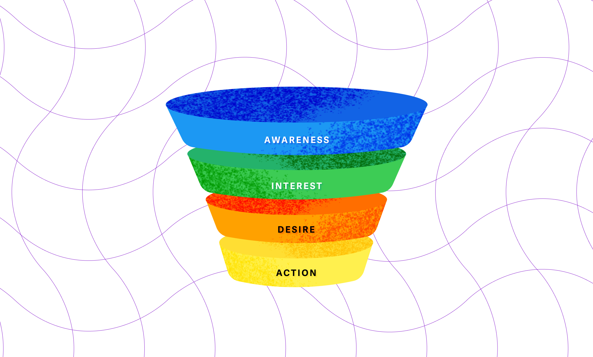
This article will, however, focus more on the experience inside the e-shop. For more information about how to also approach brand awareness, you can consult E-Commerce Conversion Funnel.
Most e-shops have the following elements: homepage, navigation, search, category page, product detail page, shopping cart and checkout. This exact order represents the most common experience funnel you may expect. The user will most likely land on your homepage, if they haven't Googled for a specific product, and will make their way through navigation and different products, until they find what they want and finish the purchase. It often happens that users will come back later and reactivate the journey not from the top of the funnel, but from the last place they visited (e.g. a product they saved, or the shopping cart).
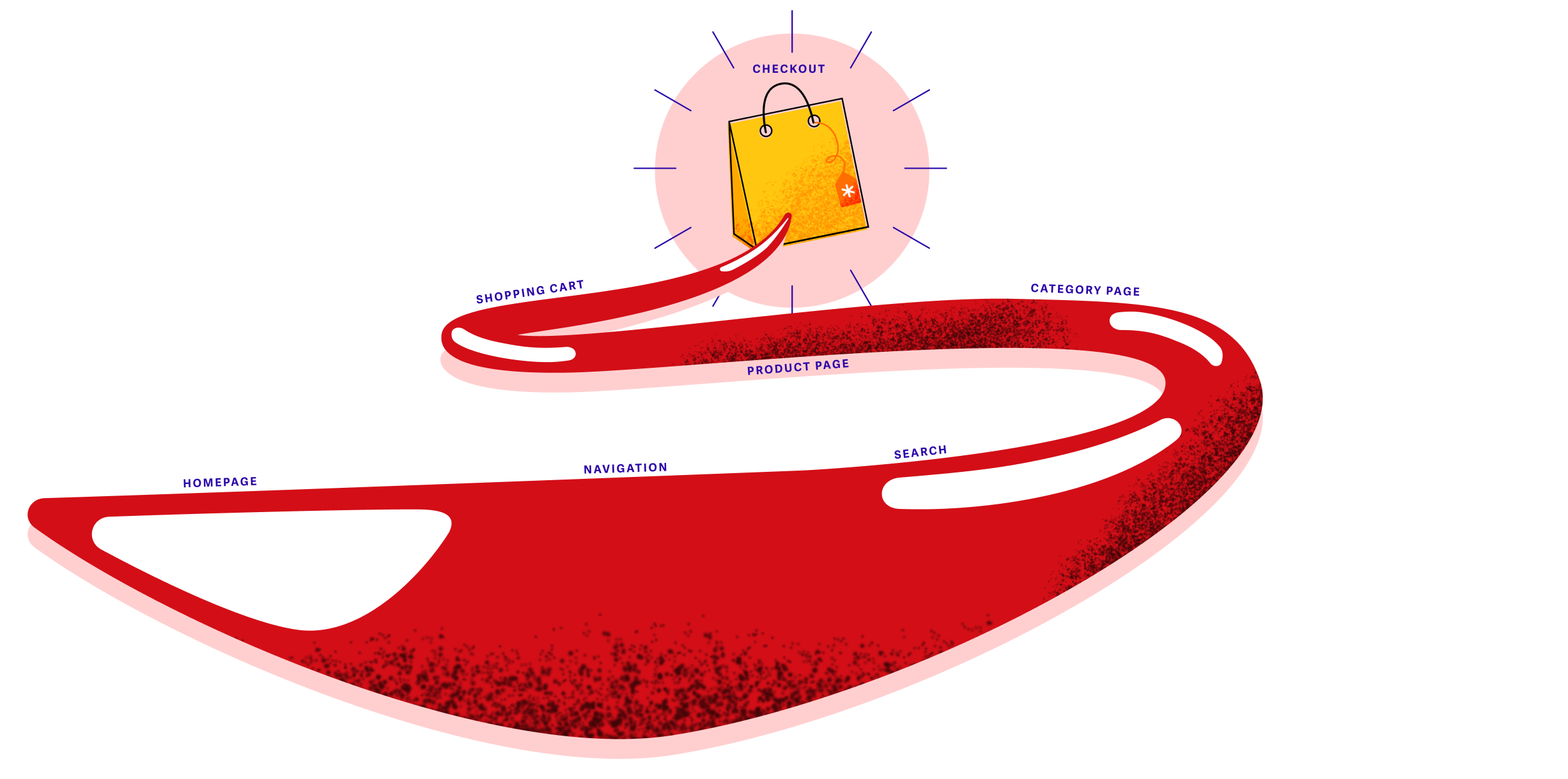
The first step to create your conversion funnel is to identify the user journey from end to end. What are the most common landing pages? Upon landing, what are the actions they take? At what point do they interact with the products? What do you consider a conversion: purchase or registration? It's possible to map out this journey by using the User Flow feature on Google Analytics or replaying sessions on HotJar.
With the journey at hand, the next step is to identify what triggers a signal that a user has moved from one step to another. Generally, these triggers will be your main ammunition to set up the funnel. Assuming that you already have Google Analytics installed on your e-shop, the next step shouldn't be complicated. It consists of setting up Goals on the tool. Since our main goal here is to discuss UX best practices and improvements for the funnel, we won't dig deeper into setting up funnels. For a detailed step-by-step guide, you can read How to Set Up Conversion Funnels in Google Analytics.
The 5 types of shoppers
Before we jump right into the improvements, it's important to become aware that not all users are born equal. I commonly hear the statement "our target audience is everyone" and while it's true that anyone may stumble randomly upon your e-shop, probably a smaller set of people is more likely to type the correct words on Google that will lead to your site. If we skip demographics, e-shopper behaviour generally falls into 5 categories:
- Product Focused Shopper - who is mostly interested in a specific product
- Browser - who is just checking what's new or trending
- Researcher - who wants to buy something, but still have a lot of unanswered questions, so probably won't buy anything today
- Good Deal Hunter - who is out looking to make a good deal
- One-Time Shopper - who doesn't want any strings attached, all that is important is to buy that one product, but how does this site work?
Each shopper will rely more heavily on different parts of the e-shop. Being able to identify these behaviors will help you prioritise which improvements to make. But beware that sometimes in a single session a unique user may wear different hats, one can be a Researcher and a Good Deal Hunter. Generally, this is the behavior you can expect from each shopper:
- Product Focused Shopper - who is going to rely heavily on search or navigation
- Browser - who is going to scroll down the front page and look through some news, trending products or charts
- Researcher - who is going to power-use everything offered to figure out which product is best (navigation, search, product comparison, ratings, recommendations, tests, best sellers, etc.)
- Good Deal Hunter - who is going to be aware of anything indicating discounts and offers, on the front page, category list or any other place
- One-Time Shopper - who probably will try to use a guest checkout soon after finding what they want
Have you seen any of these behaviors in your user base before? Maybe you can even identify yourself as one or multiple of these personalities.
Improving the funnel, one element at a time
We'll start from the top with the Homepage and move our way down the funnel.
Homepage
The homepage is where most users will land if they haven't Googled any specific keyword leading directly to a product page. Instantly, two questions come to their minds "Can I shop here?" and "What can I buy here?". These may sound like obvious questions, but they cross people's minds frequently. For shops like Nay or Martinus, it's very obvious from the first glance that they sell electronics and books, respectively, but could it be possible that clothing and board games are sold as well? Another example comes from telco websites. More often than not, users will land on a frontpage that is very coy about displaying prices, so how can they assume that products are actually being sold?
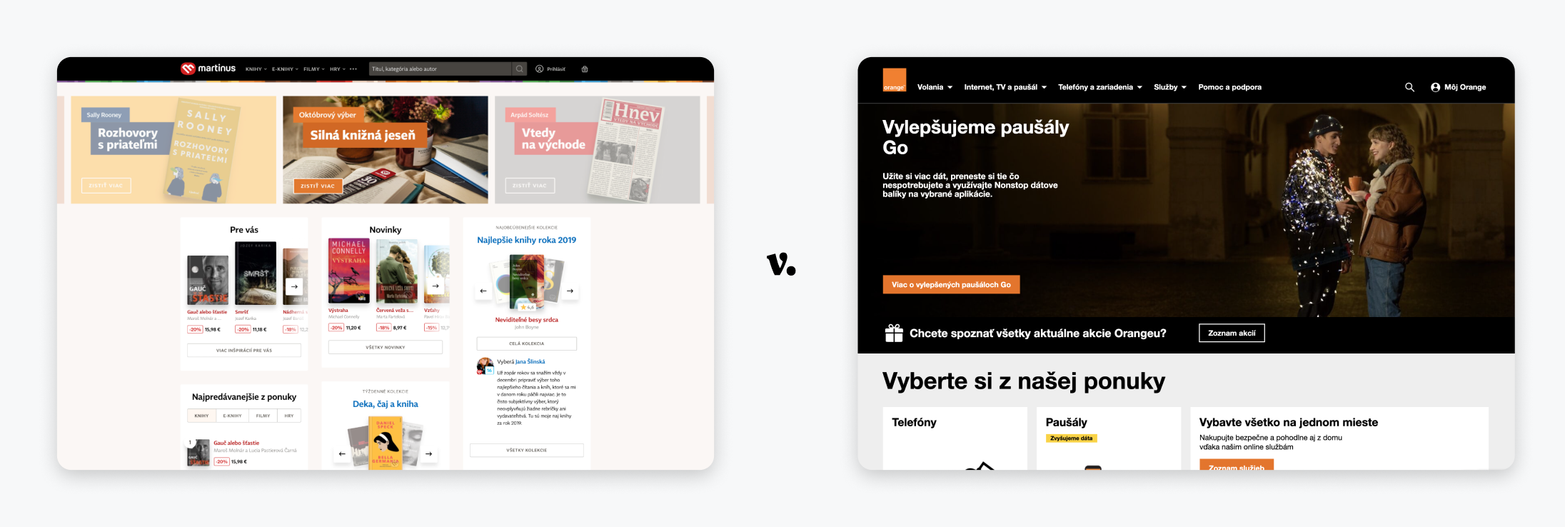
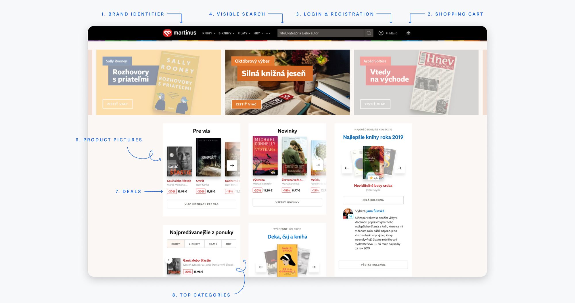
The frontpage is very important for Browsers, Deal Hunters and One-Time Shoppers. It's the very first impression and not meeting their expectations can cause a significant drop in the top of the conversion funnel. To help users orient themselves during their first visits, here are some elements that are a must-have:
- Brand identifier - company logo and e-shop name
- Shopping cart
- Login & registration
- Visible search
- Clear value proposition
- Product pictures
- Promotions and currently discounted products
- Top categories
Other useful information may also be included to raise credibility, answer questions from demanding customers like the Researchers and help with customer service. These are some points to consider:
- Payment methods
- Delivery options and duration
- FAQs
- Contact to customer service
- Help and support
- Trial period, returns and reimbursement
Search
It's the Product Focused Shopper's best friend. A well-designed search system allows users to find relevant products more easily, after all if users can't find something, in their heads, it means that it doesn't exist. Normally, a search system should contain 3 main elements: the search bar, autocomplete and a results page.
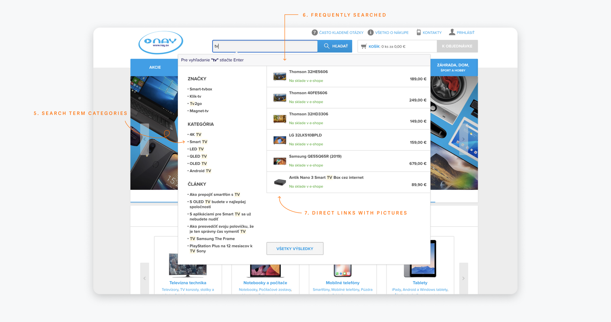
The search bar should be available on every page, be large and in a shape users will be able to identify while scanning pages (1). To help users type in the best keywords and remember what they've inputted, it's best to present meaningful search tips (2) and for the bar to be large enough to fit the entire search query (3).

While interacting with the search engine, users may benefit from autocomplete, as it effectively helps them get to the product detail page, bypassing results. Some of the best autocomplete practices include: using most frequently searched terms (4), displaying search terms categories (5), offering frequently and recently researched products (6), and having direct links to products with pictures and prices (7).
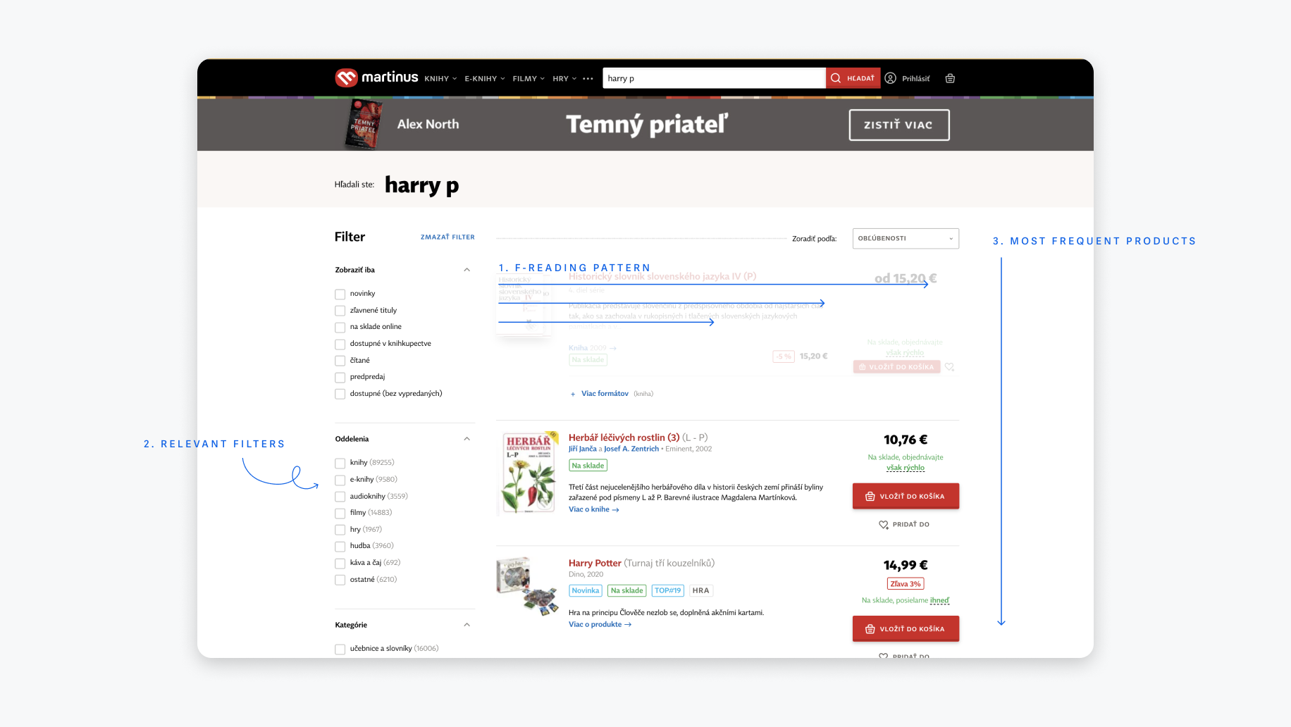
Finally, typing search terms into the bar and confirming culminates in results. The biggest pitfall of results pages is overwhelming the user with information to the point they are not able to separate the good from the bad. It's enough to display product image, name and description, price and any relevant deals or discounts. Further information could be added, but it would be best to validate their effectiveness on the funnel via A/B tests. Besides the basic information about a product, users should also have support features to help them sort out what is most relevant to them. These are some of the best practices:
- Allow users to scan search results through an F reading pattern
- Filters relevant to the set of results displayed
- Show most frequently and recently searched products
- Suggest most frequently searched terms and categories, when no results are available
Category page
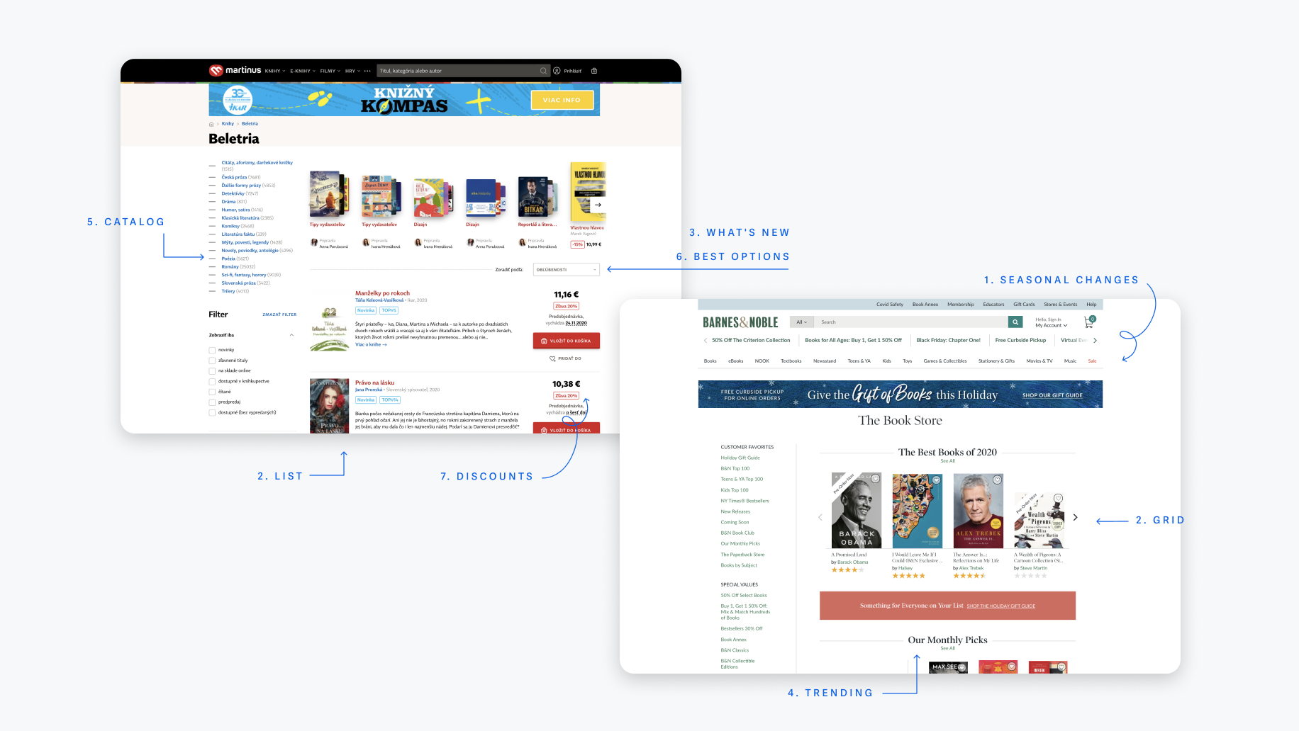
For simplicity, many e-shops keep a similar design between search result pages and category pages. While that's a fair approach, they can miss out on great opportunities to boost the user flow. Category pages can be used to give an overview of the products while aiming at findability and discoverability. For many users, it's the first impression on the products, so it's important to keep it interesting and dynamic, for example with seasonal changes (1) and options to see the catalog as a list or grid (2).
Browsers rely heavily on category pages to discover what's new (3), trending (4) or simply what is the offer from the store (5). Researchers use it to assure themselves they have found the best options for the product they seek (6). Furthermore, it's a great place to showcase discounts for Deal Hunters (7).
Product detail
When was the last time that you made an impulsive purchase? Do you remember what you felt like when you were doing that decision? Chances are that what you've seen on the product page tipped you over the edge. Apple is probably the best example of how to showcase a product in a way that evokes an emotional reaction out of people. However, not every store can be Apple. Most stores don't have the time or money to design special product pages for each of their products, and having thousands of products on offer doesn't help.
The question that remains is "how can you evoke a visceral reaction to convert users, without unlimited budget?". The short answer is that product pages should rely heavily on visuals, while trying to make the customer see themselves using the product. Here are some tips on how to accomplish this:
- Provide high quality detailed pictures from different angles
- Place the product on their natural usage environment
- Consider the case when bad pictures are inevitable
- Offer 360° visualisations or videos
- Display effective and clear headings
- Don't forget about all the crucial information (technical parameters, dimensions, transport, service, etc.)
Conclusion
Shopping carts and checkouts are not as major dropout points as the remaining points of the funnel, so we've decided to leave them out this time around, but we will approach the subject later on. Let us know if you'd like us to delve deep into it.
Best practices are not called rules for a reason, they may not always work depending on the context. Always think of your customer first and whether any improvements you plan to implement will really contribute to the betterment of their journey, but if this is the first time you're diving into building a funnel and improving its steps, the fact that you've decided to do so is already a major accomplishment.
If you'd like to learn how we have approached the innovative redesign of Martinus, the leading and biggest bookseller in Slovakia, come check our case study.
If you need help with boosting your performance or launching new products and services, let's have a chat.
This article was co-created by Stanislav Rykalský and Walter Lima.
