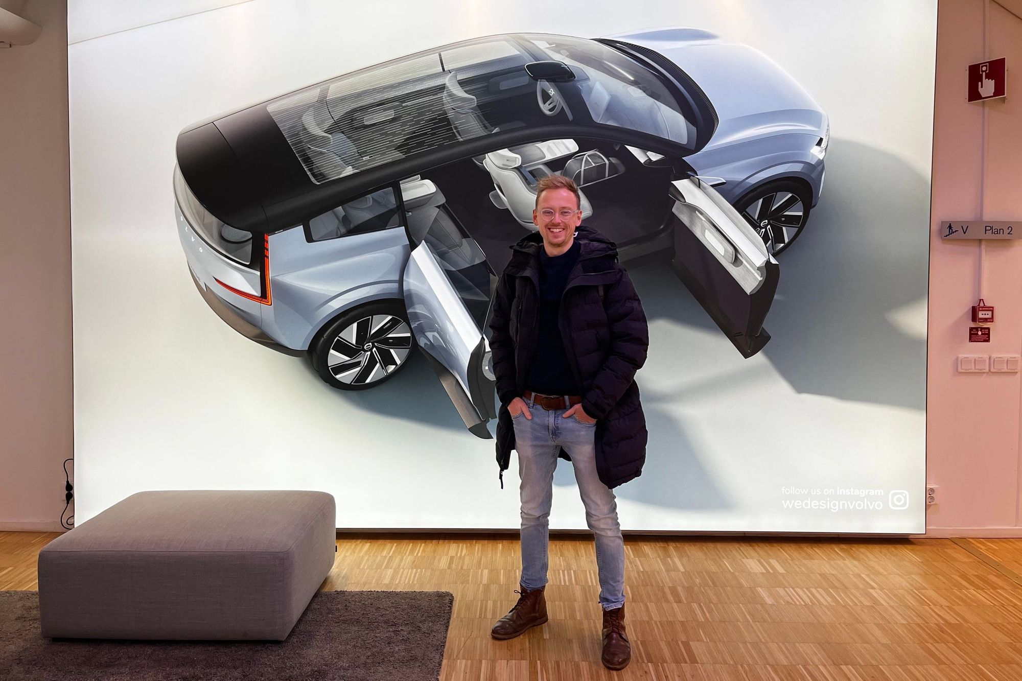
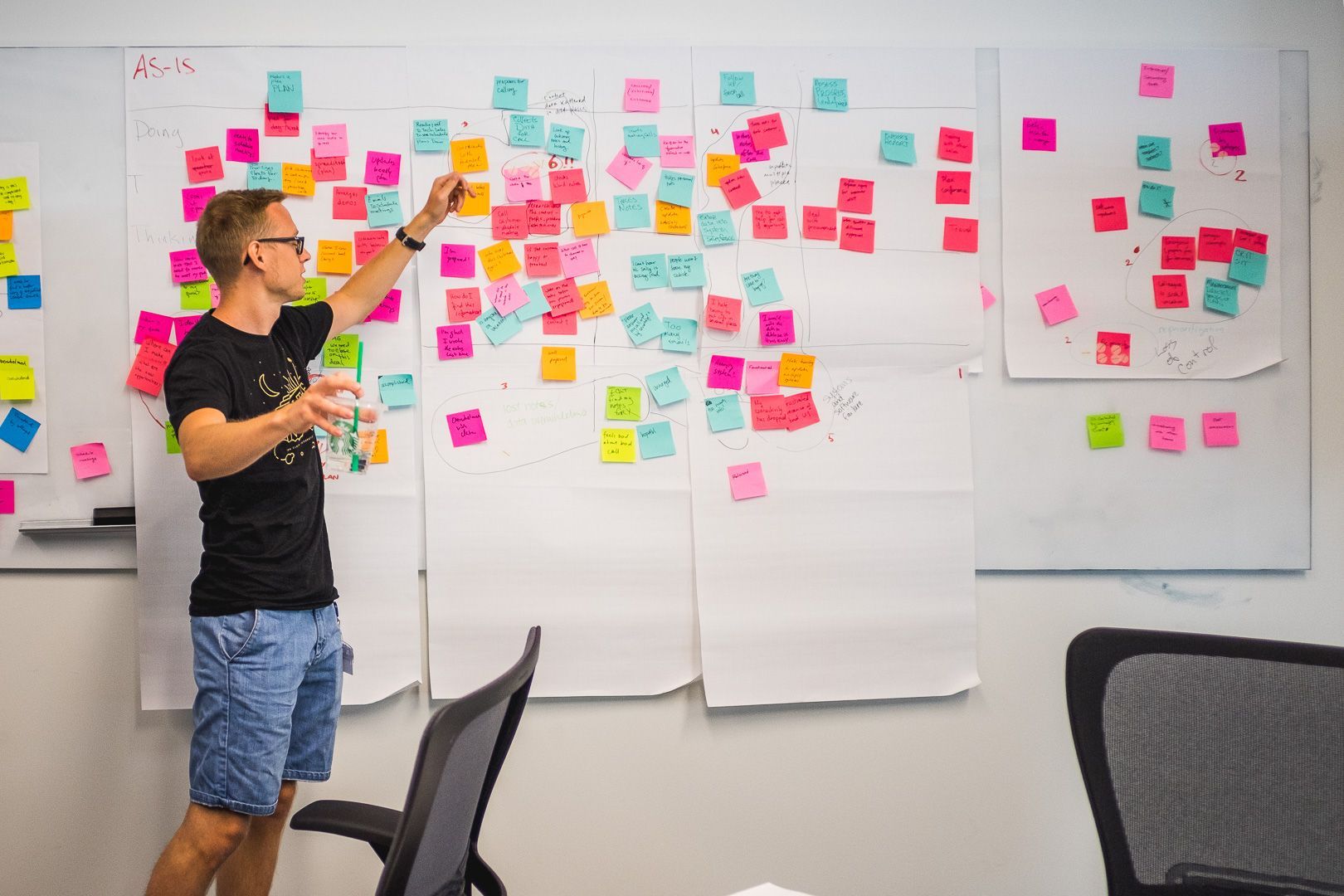
Ondrej Homola has an incredibly exciting design job – he designs in-car interfaces. We got to know Ondro at the beginning of the collaboration between Lighting Beetle* and Škoda. Today, he is the Lead UX Designer at Volvo in Sweden.
Digital automotive design has been a major topic for us since we started working with Škoda. Therefore, in the 13th episode of the Minimum Viable Podcast, Michal Blažej tries to find out what constitutes the user and overall Customer Experience in the automotive industry, and what its future will look like.
If the topic of design in the automotive industry intrigues you, Ondrej recommends following NetCarShow and vlogs from Carwow as additional resources. He also follows blogs from Matej Káninský and he suggests taking the design thinking course by IBM for all UX designers. To stay updated he listens to The Vergecast Podcast. And if you want to ask him additional questions, you can find his profile on LinkedIn.
Minimum Viable Podcast is brought to you by the CX design studio Lighting Beetle*. It's usually recorded in the Slovak language, however, you can read an English transcription of this episode below. For more content in English, including case studies and handouts, visit our Journal.
You can find Minimum Viable Podcast on:
- Spotify
- Apple Podcasts
- Google Podcasts
- Anchor
- Castbox
- or below in full transcription.
I'll start broadly. What is everything that’s designed in a car?
Mainly the exterior and interior, things that we see. Then there are many hidden things like electrification that are designed. How the car can be charged, how certain things open... With the exterior and interior, it's sculpture, creating a piece of art. And into this came user experience in cars, or in-car design, or in-car user experience design. It's digital design, something new for car manufacturers. On one hand, there are startups like Tesla, Lucid, and Rivian in America that have been focusing on user experience from the very beginning. But when it comes to traditional automakers, it doesn't work that way.
I heard that even the sound of closing car doors is designed. Is that an old or a new thing in automotive design?
That's been around for a long time, it's fine-tuning the details to make everything work - a hardware matter - pieces of metal, plastic, rubber, and the entire system of how it closes and opens. Those are things automakers are very good at. But what happens before and after that is a bit more complicated. For instance, how the car understands it's you when you approach, it opens the door for you, you sit down, and it recognizes you, etc.

That could already be called a Customer Experience since we're looking at the product from the customer's perspective. How did this topic enter the Automotive Industry?
Maybe it's cliché to talk about the iPhone, but that's where the shift actually started. Today, we can buy an iPhone for around a thousand euros, but infotainment costs two to three thousand euros. And then you start to wonder why you should buy navigation in a car when it's essentially worse and more expensive than the phone itself. Car manufacturers started realizing that phones are their competition and they need to get closer to them. For this case, the term "fluid expectations" is used, where people expect the same experience in the car as they have on their phones.
What's the difference when designing a mobile app versus digital design inside a car? What needs to be considered for these different interfaces?
When designing for a car, it's important to consider that we drive in cars, so the primary function of a car is to drive. We don't have autonomous driving yet, or at least its level isn't so good that we don't need to pay attention anymore. Therefore, the app or infotainment must be easily operable while driving. In a mobile app, you handle everything immediately, but in a car I might click, not do anything for three seconds, and then click again because in the meantime I had to use the turn signal, look left, right, etc.
So, we try to simplify the steps, provide less information in the infotainment, break it down, and mainly focus on ergonomics. How far is the button from the user, in which part of the car? Will the steering wheel cover it? For instance, it's worse to put something in the upper right corner - the hand won't reach there.
You mentioned the term "infotainment," could you explain it for absolute beginners?
My wife once said that I'm doing IT stuff in dashboards. We mean the displays in the car, both touch and non-touch. There are several names for it: infotainment, HMI, Human Machine Interface. We have a display in front of the driver, another display for infotainment or entertainment, where you have things like phone calls, maps, etc. Within in-car user experience, we also have buttons on the steering wheel, levers under the steering wheel, or a head-up display, as well as other buttons located on the center console. All of this is in-car UX.
"Automotive Design is cool – you're designing for millions of people for multiple generations."
We often dealt with UX, like how a website or a form looks, but soon we had to switch to CX and address all the processes around it to provide customers with a good Customer Experience. How is this in the automotive industry?
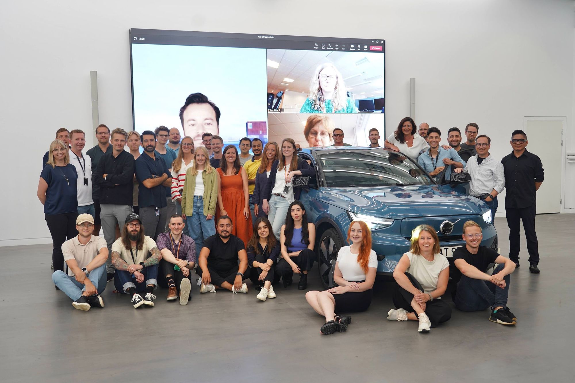
At Volvo, where I work now, there are 150 designers: UX, UI researchers, prototypers, a whole group of people called "car UX." We have teams working on the web, mobile, retail applications, and car UX. The idea is the following: I'm interested in buying or renting a car, I've already ordered it, I have a mobile app, it beeps to notify me that the car is ready, and I can go pick it up. When I get into the car, it already knows everything about me. We try to connect all these systems together.
The truth is, I do car UX, so I only look at one thing, but you're right that it's not just in-car UX because there's also outside-car UX, which is how I get into the car, where the door handles are, how I open the trunk when my hands are full, how the car greets me, how I recognize it when I'm surrounded by ten white Volvos.
How does the collaboration between interior designers and digital designers work? In the companies we work with, we often see that departments doing almost the same thing barely communicate with each other.
I see that interior designers are truly talented people. They can come up with an interior that fits the brand and doesn't burden you with, for example, too much chrome... What interior design lacks is that they could engage in more UX processes. Here we could help them, test what they've come up with, whether it makes sense or if it's just cool. This is a very common problem in the automotive industry. Things that are aesthetically pleasing but make absolutely no sense are being addressed. This unnecessarily draws attention or even worsens the car experience. So, there is collaboration, but it could certainly be better

Who is responsible for the sounds in cars?
That depends on the car manufacturer. For instance, in the past, sounds of turn signals were made by electric switches that clicked. Today, everything is digitalized, so you can use any sound you wish. With electric cars, the car even hums through the speakers, which is quite amusing. I'm really happy that we have a team at Volvo that deals with every sound in detail. They're figuring out how the blinkers should work, what sound should play when you don't fasten your seatbelt, and so on. We're trying to come up with ways to make users enjoy parking their cars. So that not all sensors beep loudly, thus making you afraid of crashing. And while those sensors are beeping, someone else might walk by or call you…
In a car, it can be quite easily tested. Either you connect your phone to the car via Bluetooth and play those sounds, or you have a car with a sophisticated system inside that allows you to change every sound.
What limitations frustrate you? Regulations, safety, or that someone came up with something new?
In the entire automotive industry, everything takes a long time. Automotive design is cool – you're designing things for millions of people for multiple generations. But it takes a long time, and there are many legislative requirements.
Some limitations are hardware-related. It's about something that was agreed upon five years ago, so it can't be changed. For example, at Škoda I needed to change some buttons. We researched it, designed it to make sense, and then we hit the response that it can't be changed. Changing one button would cost us hundreds of thousands of euros, so we closed it by saying it's not possible.
Regarding regulations, there are plenty. For instance, the novelty is that every car must detect speed. If you go faster, it will beep five times in a row. We at Volvo want safe driving, but we know that everyone drives about 10% above or below the limit. So, this isn't simple, and we need to solve it. And now we're faced with a question – how do you design that sound so that it doesn't annoy people?
We have tons of legislative things too. For instance, all those icons that shown in front of the driver which signal various problems. In English, they're called "tell-tales". There are so many of them and each has a prescribed color, appearance, and so on. Imagine you were able to solved the whole layout. You stacked 20 icons next to each other, you played around with single pixels, everything precisely fits, and then at the end of the project, someone comes with the question: "Where will this next icon go?" These kinds of things happen, and you have to take it responsibly.
Very few automakers do good In-car Design. That gives us a unique opportunity to define the entire market from scratch.
You mentioned that many things are planned years ahead, but there are car manufacturers today who are capable of updating these systems on the go. Are all car manufacturers moving in this direction, or are some still too conservative?
Tesla can provide 26 system updates in a week. A brand like BMW, a premium manufacturer, might offer four updates in four years. Which is nothing. The system isn't ready for it, and they also don't want users to be bombarded with update prompts all the time. With a Tesla, you can remotely adjust settings like suspension, and chassis to make it sportier or more comfortable. But there are still many hardware aspects we cannot move, like the steering wheel or display.
Car manufacturers often struggle to complete a car on time, just like with mobile apps or websites. They create something halfway baked and then gradually add things to it. And I believe that's the direction cars will take. So essentially, we'll be buying a living product.
Are the methods in your UX design the same as mine? Do you follow the standard Double Diamond process or the UCD process, research, and so on? Do you use the same project phases?
Mostly yes. I like to combine UX and design thinking, essentially following the Double Diamond process. There are processes that happen during car development before it comes to us, and we don't have an impact on those. But then other things come, scenarios and pain points, that are dealt with by us. There we function similarly to you. So, we have research, and ideation, we try various things, test with people, get approval from management, and then it goes into production, which involves documentation, specifications, and so on.
So, in essence, during the research and ideation, you use standard procedures like in-depth interviews, focus groups, and so on?
I combine research with testing because to me, they're almost the same. I understand that research happens separately and in an earlier phase, but for me, it's extremely important to see how people use the product we've created and whether it can actually work while driving. Often, we only see it on screens and in Figma, where it works. But when a person drives in real traffic, they behave completely differently, and we don't realize that what we've done doesn't work. That's a great moment.

Let's talk about prototyping and testing. Since we worked on it at LB* with Škoda, we've tried various things, like gluing the infotainment display on a car dashboard. How do you do it? How do you prototype and test at Volvo?
At Volvo, we have several options we can use during the process or when needed. We have a test car - a model that's currently on the road but has certain hardware and software elements from a new model, things that we need to test. It all runs on React, so it's a separate piece of code that has nothing to do with reality, but it allows us to test many things.
Since it's web technology, we can do it very quickly. This allows us to click through the exact same things that are in the car, right in the browser. But when you're sitting at work or at home and using the interface on a laptop with a touchpad, that's not a real experience. So we also have something called UX bucks - interior modules, so-called detached interiors, with one or two seats that can be adjusted. There's a steering wheel, pedals, and displays onto which we can project our code or even Figma. So if I want to test something quickly, I can open Figma Mirror or run our code, see it in front of me, click through it in a way that's much closer to real usage."
How does this testing process work?
We have a speaker connected via Bluetooth, and people can connect remotely and watch. For me, it's important that my team and people around me can turn it on and see at least something from the testing. You can get a research summary, but hearing and seeing it is a different experience.
I'm also interested in the project cycle. How do you collaborate with developers?
We work in an agile way, have sprints, we deliver what they need. I came to Volvo when the project was already heading into production. So, we hold onto the concept and try to manage all the use cases to prevent anyone from changing things at the last minute. Figma now revolves around documentation – how you archive designs, hand them over to developers, do versioning…
"What interior automotive design lacks is involving more UX processes."
In your opinion, which car manufacturer has the worst In-car Design?
There aren't many companies that do it well. And that's great because we have a unique opportunity to define it from scratch. This is the kind of moment the iPhone also had, which disrupted the entire market. Keyboards disappeared, and all phones started looking similar. The automotive industry still hasn't had such a moment. We don't know where it's heading in the future. Car manufacturers are trying to address this, but they're not there yet. Currently, Subaru is the worst in my opinion, it's a disaster. They've released a new car, but they haven't updated anything for the past X years. It's really sad. Everyone looks at Tesla. There are pros and cons – some aspects are good, but Tesla doesn't always perform best in studies.
Could the solution be to just abandon infotainment? We won't design them, Google and Apple will cover it, and a piece of their software will run in every car. This is, however, opposed to the functioning of "software as a service" or "car as a service" and any subscription model. Under these circumstances, monetization would disappear from cars.
Some brands want to have their own emotions, and their own feeling. For others, it doesn't matter. But to be honest, when I work with people from Google, they also don't know how to properly design infotainment, so they learn a lot from us. Google has Android Automotive, their system, which they sell to other companies. But even their basic Android isn't robust, nor specialized. They make tools for other companies and maybe sometime in the future, when a new brand comes along that doesn't want to invest in infotainment, they'll just use this Android Automotive without any customizations. But currently, Android isn't ready to be used on its own.
Was In-car Design your big dream?
The journey to it was both simple and complicated. I come from a family of racers – my brother is Maťo Homola, my father is Jaro Homola. So my whole childhood was filled with cars. All the websites I made when I started coding or designing were about cars. The same with projects in school – I worked on some infotainment. My bachelor's thesis was about car telemetry, sending things to the cloud and displaying them on the car's screen. It was all about cars. After school, I wanted to get into Porsche, but they canceled my interview.
I ended up at IBM, where I learned more than I did at school. I studied interaction design in Edinburgh. But I learned even more about design at IBM, where they are absolutely focused on design thinking. You can run great processes there, and there's a big impact because the project you work on is used by millions of people around the world. But over time, I realized I wasn't interested in making backend systems, something that supports something else. So, I thought about what I always enjoyed and what I was actually good at. I realized I could do UX for cars and managed to get into Škoda. It's truly a challenge, and I'm excited that half a year before launch I can drive around in a camouflaged car that we're designing.
The full interview with Ondrej Homola in Slovak language:
Minimum Viable Podcast is brought to you every two months by the design studio Lighting Beetle*, which focuses on creating an exceptional customer experience.
Design is all around us. Minimum Viable Podcast explores design with a small “d” – the one that looks for solutions to people's problems. In it, together with our guests, we address topics that are related to design, but we normally do not associate with it. Thanks to the Zeldeo production studio and our production manager Mojmír Procházka for the cooperation.
We are looking forward to every listen, follow, share, and suggestion for improvement. You can send us your tips for interesting personalities with whom we can talk about design to podcast@lbstudio.sk.


