Inquisitive mind? Subscribe to our LB* Insights newsletter. No fluff, just stories to make you think.
In recent years, car manufacturers have become increasingly focused on delivering a digital experience to drivers through various digital products. Although infotainment (a dashboard multimedia touchscreen) as one of them has been around for some time, it is still in the phase of exploring and understanding the benefits it can bring to passengers.
Working with Škoda Auto for past years, we’ve witnessed the industry's shift towards a more digitized customer experience. Tons of iterations on infotainment products and collaboration with experts on in-car design helped us summarize these most influential factors to keep in mind when designing human-machine interfaces.
1. Safety all the way
The most influential factor for designing HMI is the environment. For cars, the primary interaction will always be driving and we must keep this in mind. Unlike other digital products where the goal is to keep users engaged, drivers’ focus must remain on the road to ensure safety. It might be similar for, let’s say, medical devices for surgeons.
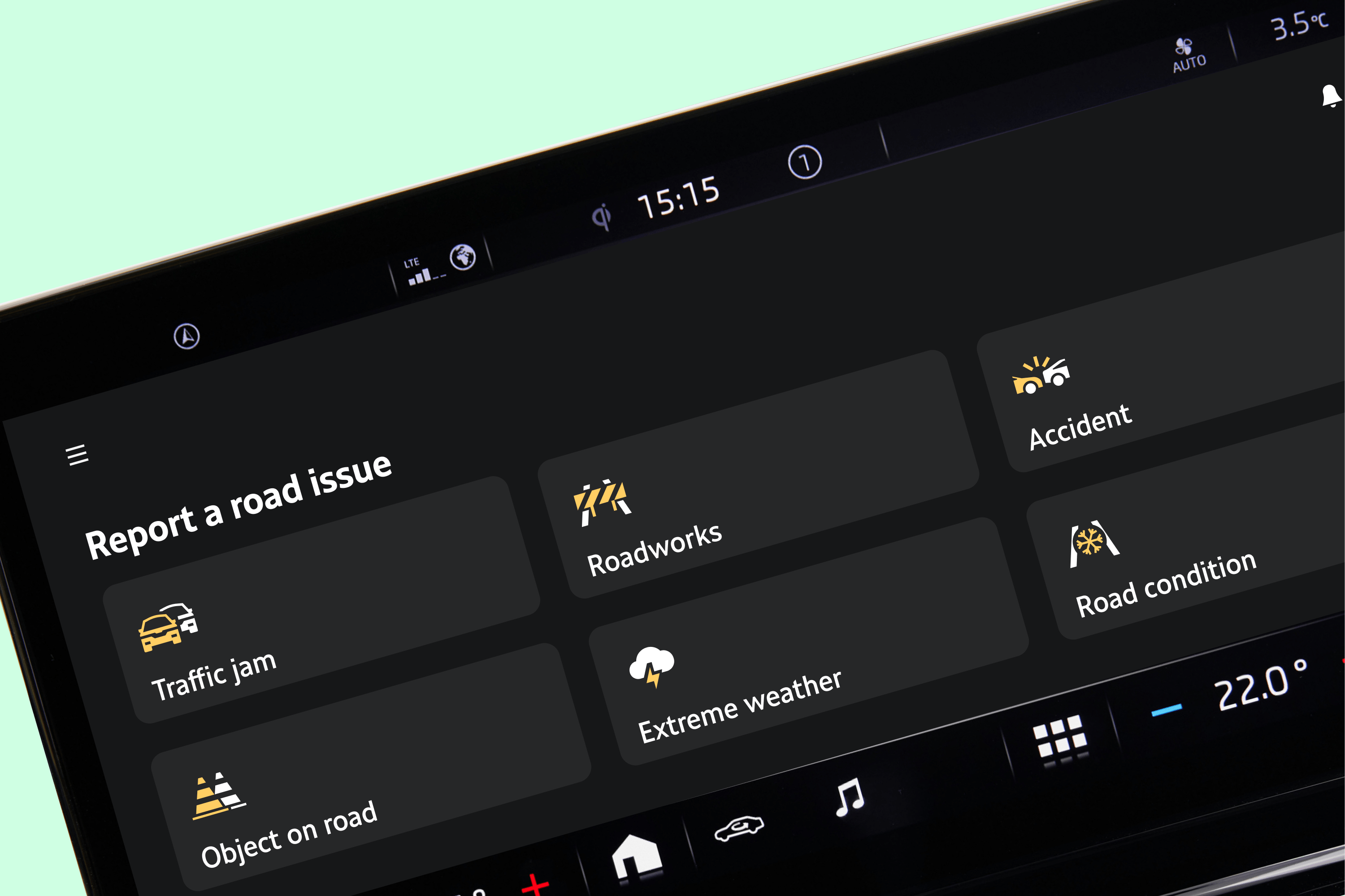
To ensure the safety of the infotainment, first, we minimize the content and interaction elements as much as possible to reduce cognitive load and to increase focus on driving. There’s even policies, e.g. the law defines the maximum text length that can be displayed while driving. If content cannot be minimized, we implement driving distraction restrictions, such as simple pop-ups that prohibit viewing some content while driving.

2. Diverse range of languages
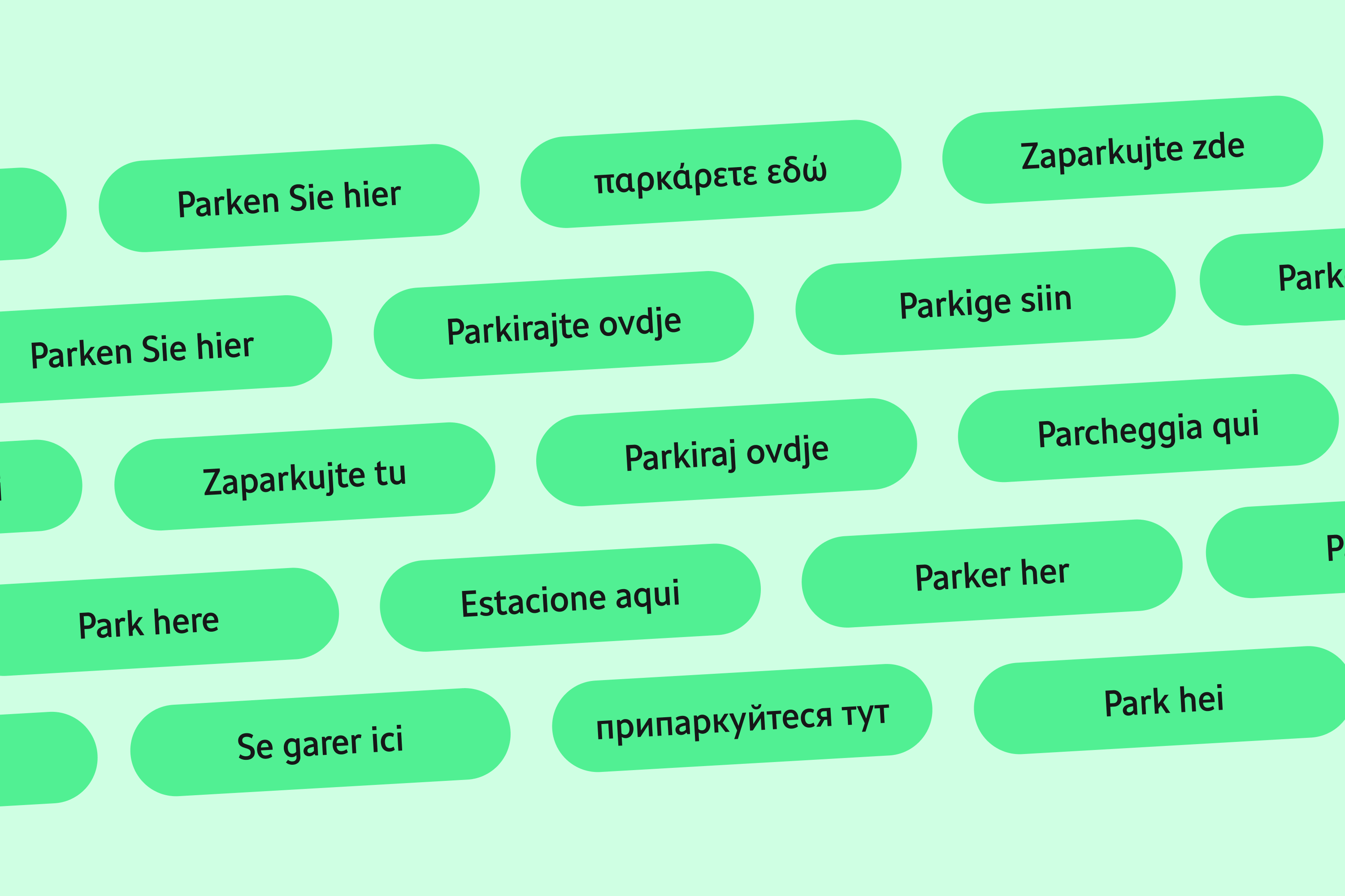
If you are aiming for an HMI design that is universal worldwide, keep in mind requirements of verbose languages. Good practice is to check the text length for each intended language even before you create the actual interface.
Škoda distributes cars to over 100 countries worldwide, so it is crucial to ensure that the designs can be easily translated and adapted to different languages. We achieve this by testing the copy in multiple languages and defining maximum text field lengths to avoid overflowing texts. In some cases, it’s inevitable to iterate a whole component to fit desired content.

3. Frequent testing
Even when following all best practices and design standards, we can never be entirely sure that our design will work without causing distractions while driving. Therefore, we conduct thorough testing with users, simulating the car environment as closely as possible.
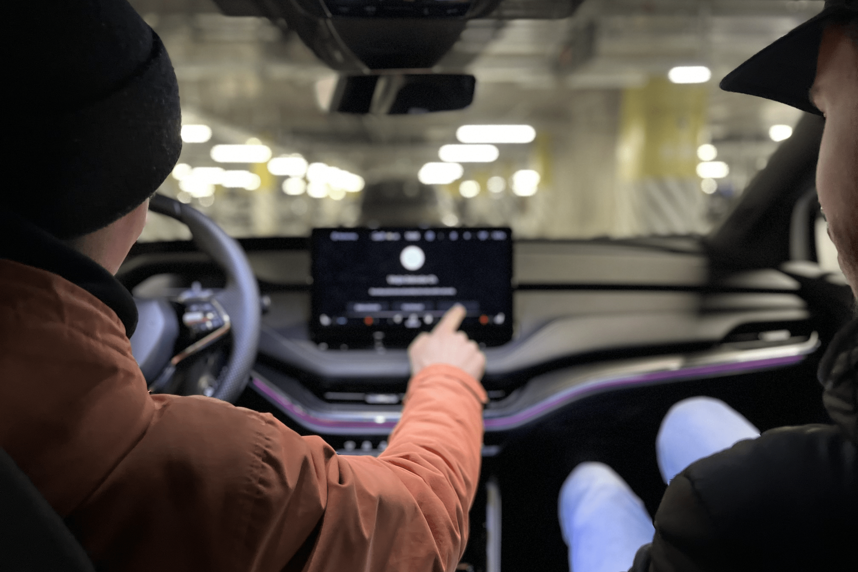
In a recent testing conducted by the Škoda HMI team, drivers were asked to ride a simulated road while conducting a simple task on the infotainment screen. Such testing indicated an optimal position for various elements and a correct size for safe accessibility while driving.
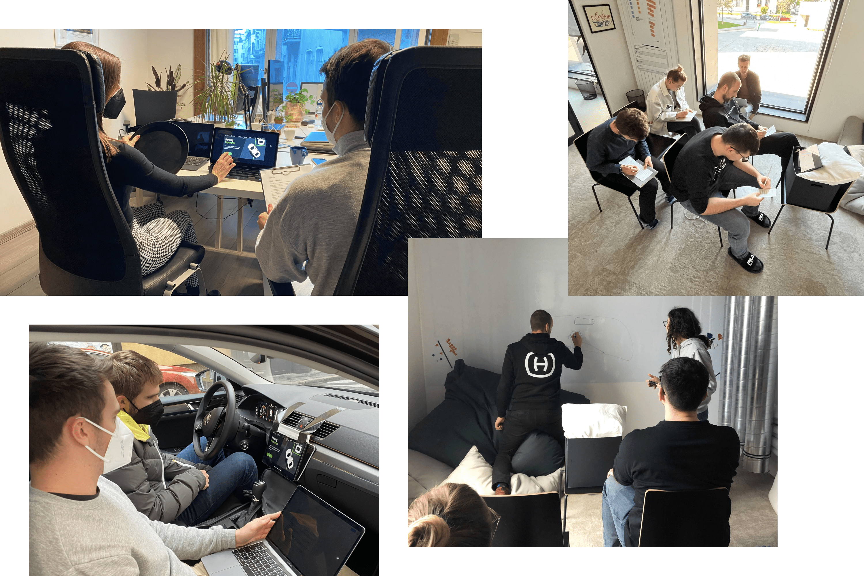
Testing is an essential part of a design process and even if you don’t have a dedicated budget, improvise with lean and guerrilla tests. For example, when we were testing the calendar app, we mounted a tablet to a car dashboard. Other times we simulate the environment in our office.

4. Mapping design patterns
Škoda cars are used by a wide range of drivers and passengers, spanning different ages, countries, and cultures. It is important to design interfaces that are easily understood by all users. By following common design patterns and conducting frequent user testing, we make our designs accessible to a wide range of customers.
For example, while designing the parking app, we looked at how they are set up in different countries across Europe, so that our design would be universal. Seek for patterns your customer segment is accustomed to, and don’t forget to check for technical limitations, as well.

5. Seamless journey across touchpoints
To ensure a cohesive customer experience, we cannot work in a vacuum. Infotainment is just one part of the digital experience provided by any car manufacturer. If we are considering a certain design change, we must take into account all dependencies it causes on other touchpoints and streams.
The Pay to Park service, which allows a user to pay for parking based on the car position, is a good example. Besides infotainment, the feature is also accessible from MyŠkoda App, designed by a different team. While working on the app, we needed to meet with the mobile design team regularly to make sure we are delivering as close an experience between these two touch points as possible. If we want to keep the design user-friendly, it needs to be consistent.
Where do the roads of car infotainment lead to?
Compared to digital products, the slower pace of product delivery in the car industry has historically resulted in technical debt in many cars. As a result, relatively new cars might have interfaces that appear outdated. This delay can make it challenging for car manufacturers to compete with mobile apps providing similar functions or with mirroring services like CarPlay or Android Auto.
On the other hand, it creates huge potential. With the car becoming more of a living organism, we can expect them to be more about software and less about hardware. And infotainment will be a big part of the puzzle. For more visions of the future of the automotive industry, I recommend the episode of our Minimum Viable Podcast with Ondrej Homola, the Lead UX Designer at Volvo. You can listen to it in the Slovak language or read the English translation.


