Online offer of TV as a foundation for Orange design system
How we made it easier and faster for Orange TV customers to choose

In short
- Services
- Product design
- Industry
- Telecommunication
- Capabilities
- Conversion improvement
- Ecommerce
- User experience
About the project
The market for TV services in Slovakia has been quite saturated for several years. Gaining a stronger share in this environment requires not only an exceptional offer, but also a clear communication to the customer. Using the Content-First approach and the components of the emerging design system, we helped Orange Slovensko redesign the website offering the new TV services.
Challenge
Communicate the quality offer of the service in an intuitive and human way. Create a clear design consistent with the design strategy and validate the new components of the emerging design system.
Solution
Fast prototyping thanks to the components already existing in the design system. Applying Content-First approach and principles of the user-centered design, and continuous acquisition of user feedback.
Design Strategy
In-depth customer interviews and customer journey analysis at Orange stores across Slovakia preceded the website redesign. Based on research, we have created a detailed design strategy for the operator. Among other things, it also defines how Orange should offer its services in ecommerce.
During the research the customers disclosed that they have difficulties shopping the telco services online. They cannot make a decision based on the technical parameters and lots of them do not even understand the information. Therefore, the usual customer journey often requires visiting a point of sale where they rely on explanations from the vendor and help with the selection.
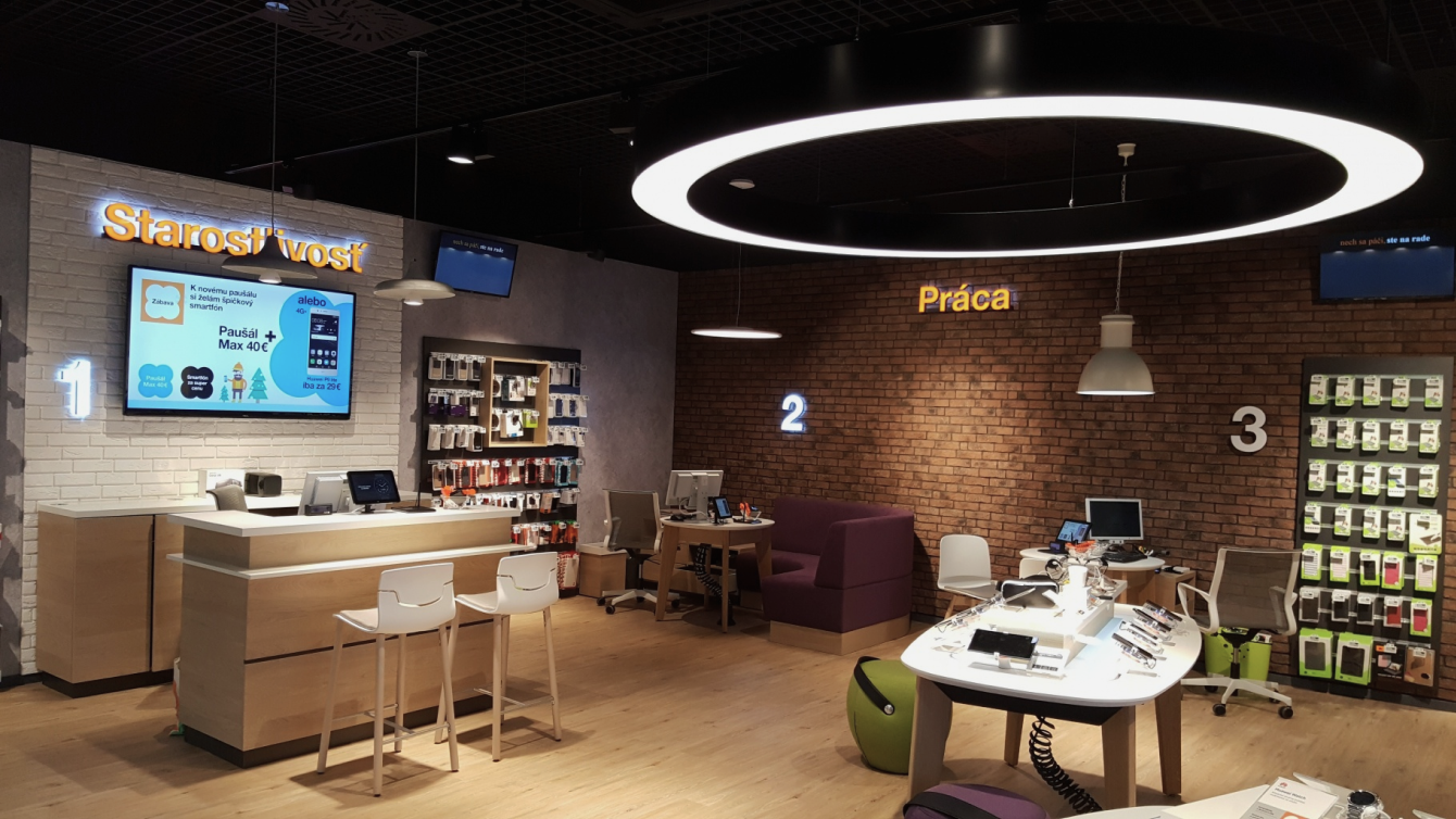
The main principle of the design strategy for Orange.sk: The user experience when shopping online should remind the experience when shopping at a store.
With the same hypothesis, we also embarked for the redesign of Orange TV online offer. The site full of hard-to-understand technical shortcuts and FAQs have not been responsive to mobile devices, too. This made it even more difficult to be read and understood, so the TV packages were primarily sold in stores.
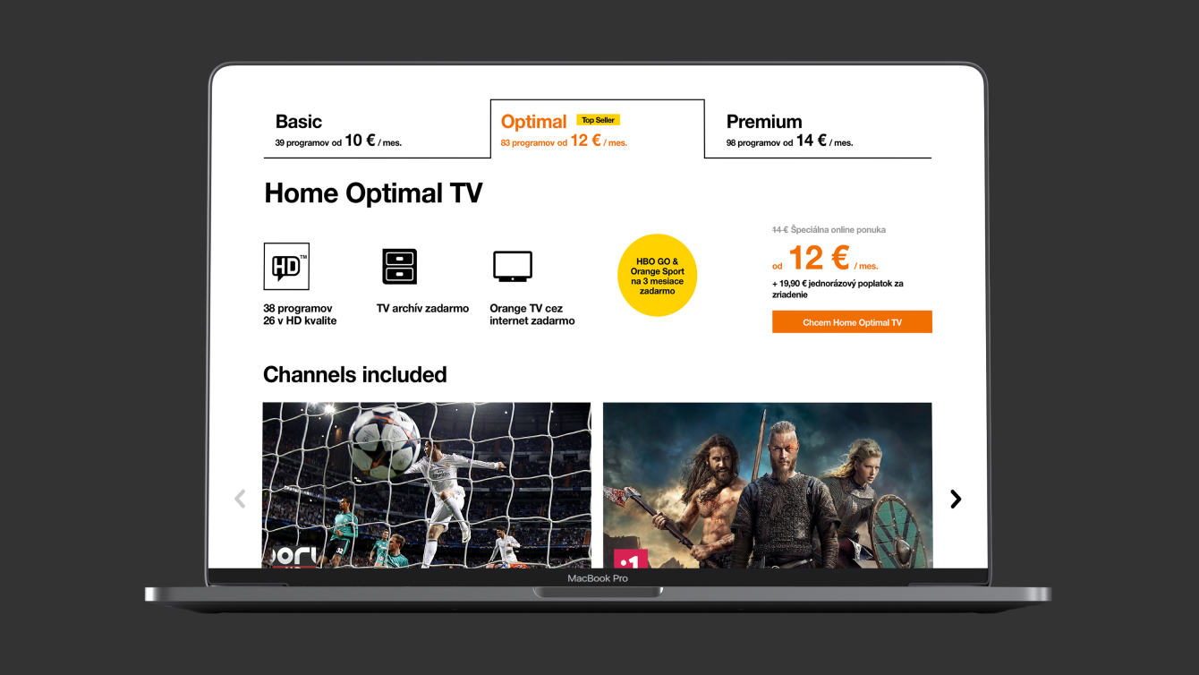
Online TV offer before and after the redesign
The key component
To make the online shopping of TV services easier for the customers, in the new design we have reduced the technical information to the necessary. In the initial analysis we interviewed the trainer of salespeople and found out the most frequent questions customers come to stores with and the arguments they respond best to.
Guerrilla survey confirmed that most customers do not care about the transmission technology (optical network, internet or satellite) when setting up a TV connection. First of all, they want to know which solution is available in their place of residence. We were also surprised with a finding that they do not make decisions based on the specific TV channels, but according to the type of content (news, sports, documents, etc.).
The guide never gives a negative answer. It always responds positively and offers the best available solution.
Therefore we designed a key component for the top of the page - a wizard that will immediately propose the most optimal technical and content solution. The result is based on 3 simple parameters: the desired content, address of residence and equipment the customer will use to screen the program.
Clients with better technical knowledge can still choose the service manually based on detailed technical specifications.
Showcase of the key component - the wizard
The key component
In contrast to complex technical information, previews familiar from popular movies or series are understandable to everyone. In order to encourage customers to explore the offer, we used Content-First and placed samples of popular content directly under the wizard. This makes it easier for customers to select a suitable TV package.
On launch, we wanted to offer a consistent web experience. The motif that attracted the customer in the online campaign and led him to the Orange TV website was identical to the hero banner in the page header. In this campaign, several personalized themes for different target segments were rotated.
We have also kept the answers to the questions that customers are most interested in at stores. However, thanks to the clarity of previous content, we were able to minimize the FAQ and move it to the bottom of the page.

Design system
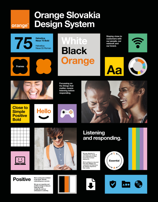
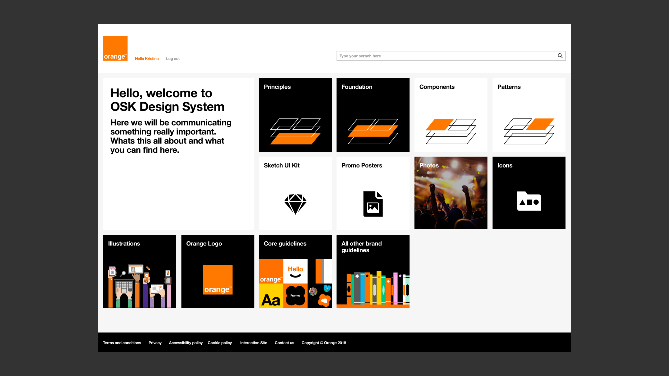
Online offer of Orange Slovensko TV services is the first project we have built using components of the emerging design system. Existing components have enabled us to quickly come up with design solutions. We were able to create several prototypes simultaneously and validate them with users on a continuous basis.
On the cornerstones of the design strategy we also created new elements to bring the online shopping experience closer to the one in-store. We merged existing and new components into patterns and were able to test their effectiveness and clarity live.
Work on this project has helped to create a robust foundation for the Orange Slovensko design system.

Martin Lancík
Head of Digital Marketing, Orange Slovensko
Some of the new components have proven their value in a short time and have become part of the design system. And because the system does not only include the library but also the documentation, they are ready for immediate use in other projects.
Want to know more?
We are here for you
Our expert Marek will provide you with a broader context, and together we will figure out which digital product will help kickstart your business.
Get in touch with Marek
Don’t miss out on
our newsletter

