Bringing innovation to an exceptional online bookstore
Martinus e-shop redesign increased mobile conversions by 25% and upsell by 160%

Results
+25%
Increase in mobile conversion rate
+160%
Increase in up-sell during checkout
+380%
Increase in offline store product reservations
In short
- Services
- Product design
- Industry
- Retail
- Capabilities
- Conversion improvement
- Customer data
- Ecommerce
- In-Store
- Omnichannel
- Redesign
- Testing
- User experience
- Website
About the project
Martinus is the leading and biggest bookseller in Slovakia founded back in 1990. The reason behind such popularity is a great user experience across all channels, wide product range and superior customer care. The website, however, had been out for 5 years and started to look outdated and inconsistent as many new features were added into the old design.
Challenge
How to redesign an online bookstore to refresh its design and reproduce the unique customer experience from physical stores under the same brand.
Solution
A website that acts like a good librarian - leads customers to what they're looking for, always advises with empathy and expertise, and helps with any additional requirements.

Simple exploration process
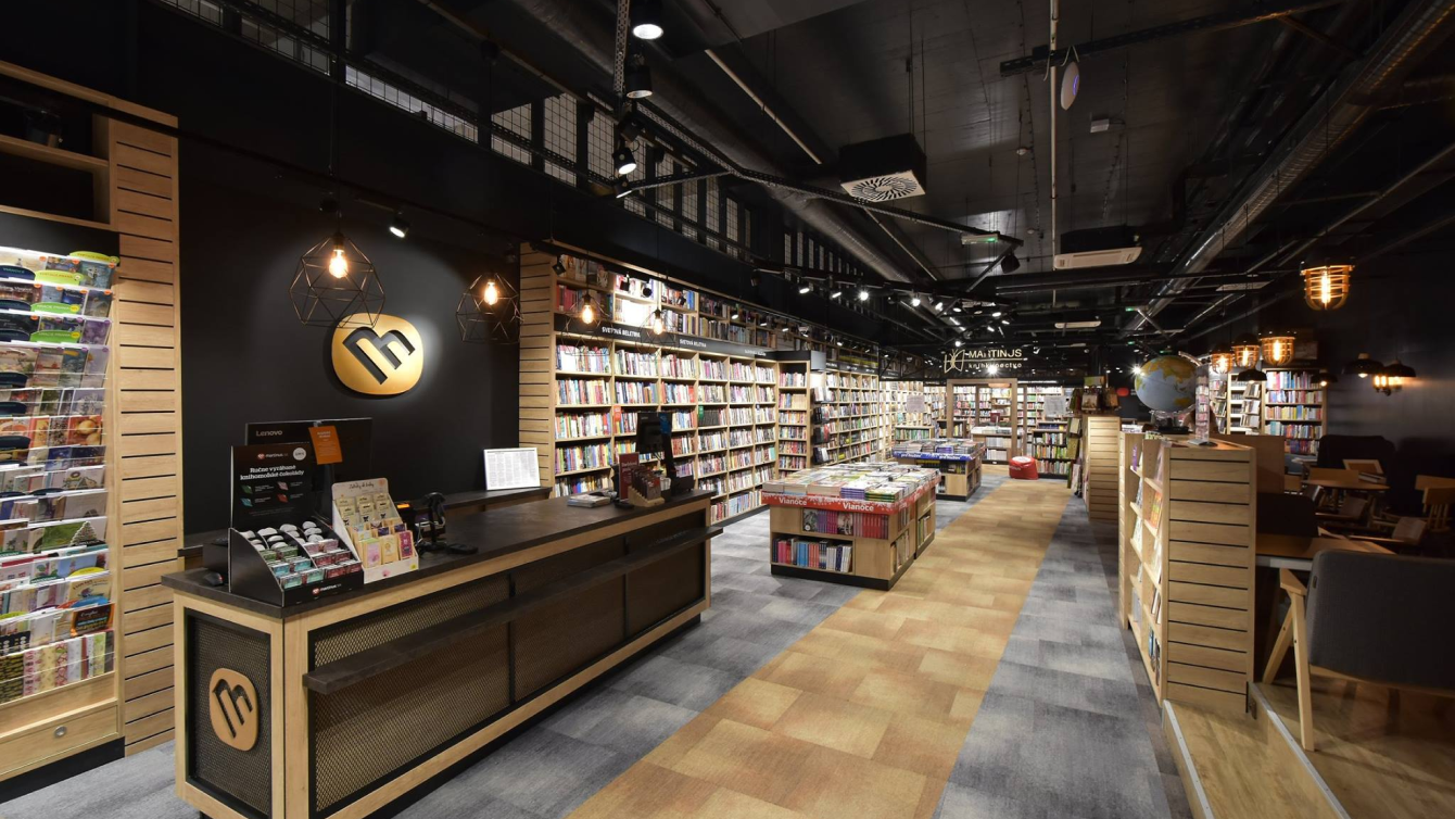
We started the whole project by visiting a Martinus physical store where we asked customers about their online and offline experience. The biggest inspiration though was the store itself with its unique atmosphere and enthusiastic staff that is always willing to help customers to discover new reads.
We wanted to translate this experience into the website. For example, we designed thematic collections that are compiled by real librarians; are experts on the given topic. These librarians personally sign under each of the collections and make them more personal. This way, customers are building relationships with librarians similarly like they do in physical stores.
The research showed that in the exploration process people also use catalogue, search, alternative products offering and user reviews. In the buying stage, customers want to pick a book format or send it as a gift. We designed all these features with great attention to detail.

Innovative features
Martinus added a lot of new features to the website in past few years, but many customers didn't even notice them. The key question therefore was - how to make them more visible? It required dozens of experiments and testing sessions to reorganize the components on the website into a coherent system where people can orientate quickly and intuitively.
To prevent such problems in the future, we made the new design flexible thanks to modular components and a living styleguide. With this solution, Martinus can add, remove or customize any feature without worrying about harming the visuality, usability or consistency in the future.


Agile and lean methodology
We designed this project in an agile way using design sprints in 3 stages - UX design, visual design and front-end development. We conducted several usability tests in each sprint using the guerilla method, which basically means we approached strangers directly in the bookstores. With this approach, our designers received feedback very quickly and were able to iterate their designs several times a week. They tested their designs with more than 60 people.
Waterfall approach

Lean UX + Agile development approach

Showcase of the iterative approach of Lean UX
Thanks to these agile and lean methodologies and very close cooperation with the client, the new website was released just 7 months after the beginning of the redesign.
Collection

Product detail with recommendations

Categories

Your library

Shopping cart

Want to know more?
We are here for you
Our expert Marek will provide you with a broader context, and together we will figure out which digital product will help kickstart your business.
Get in touch with Marek
Don’t miss out on
our newsletter

